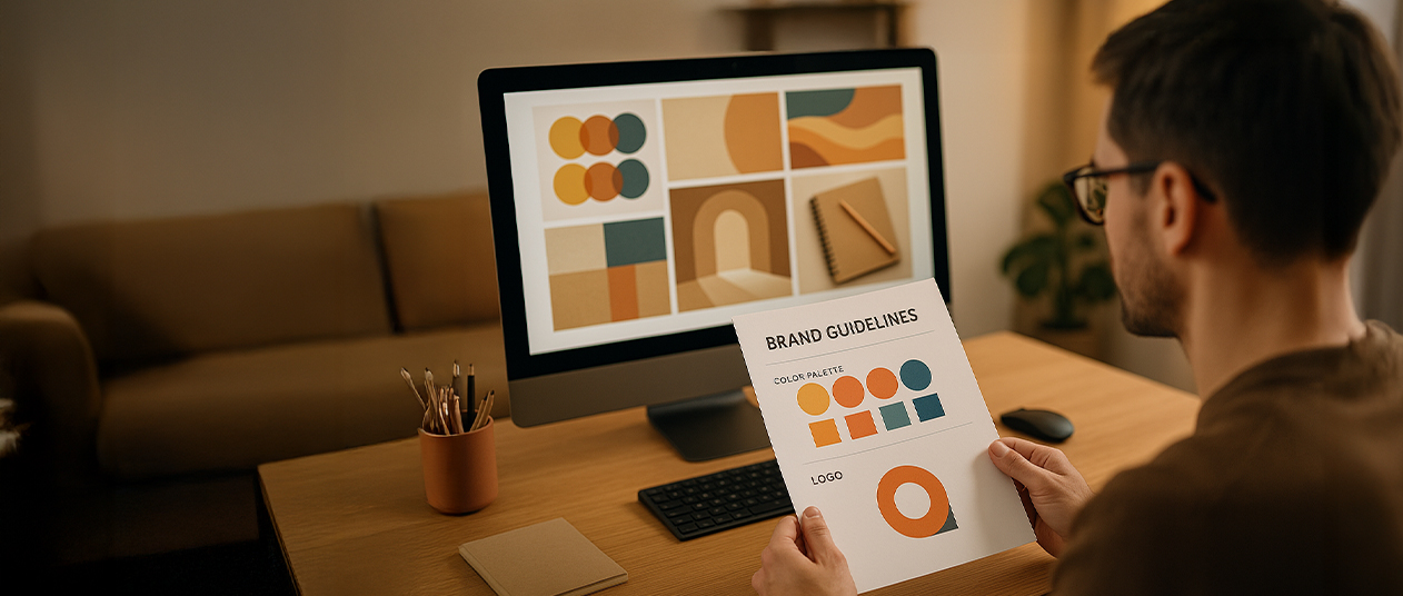
Ever looked at a logo and felt something just clicked—even if you didn’t know why?
That’s not luck. That’s alignment.
At Vedic Vastu Dubai, we often say that your company’s logo is more than just design—it’s energy made visible. It’s the first silent conversation your brand has with the world.
And like your home or office, a logo carries energy. It influences how people feel about your business before they ever speak to you. That’s why designing your company logo as per Vastu can be a quiet but powerful move.
This isn’t about following trends. It’s about making sure your logo feels like your business. And more importantly, that it carries the kind of energy you want to attract.
Most businesses think of logos in terms of visual appeal—something bold, catchy, maybe clever. But from a Vastu perspective, it goes much deeper.
Every shape, direction, and color carries a frequency. If your logo isn’t aligned with your brand’s energy, things may feel stuck—leads trickle in, partnerships don’t land, or your brand feels off, even though everything seems “right.”
At Vedic Vastu Dubai, we work with brands to create or refine logos that aren’t just good-looking—but grounded, flowing, and in sync with the business itself.
Because when you design a logo as per Vastu, you’re not just creating a symbol. You’re creating a container for intention.
How logos hold energy
Let’s break this down a bit.
A logo isn’t just a design. It has movement. Direction. Weight. It can feel light or heavy, active or stable—depending on how it’s put together.
Here’s what we often look at when consulting on vastu for company logos:
When we help clients with company logo design as per Vastu, we don’t ask them to change everything. We simply help adjust things so the logo supports the brand—not works against it.
Fire for visibility, Earth for stability
Vastu is rooted in the five elements—Earth, Water, Fire, Air, and Space. These elements don’t just exist in physical structures; they’re also reflected in design.
And yes, your logo can carry those same energies.
At Vedic Vastu Dubai, we often start by asking: What’s the core energy of your brand? Then we help you design a logo that reflects that—elementally and energetically.
Quiet transformations after realignment
Let’s bring this closer to home.
A boutique consulting firm in Dubai reached out to us last year. They had a strong business but felt their brand never quite landed. Their logo was clean, modern, but felt… flat.
Here’s what we noticed:
We didn’t suggest a full rebrand. Just realignment.
The results weren’t dramatic. But they were real. Better client retention. More clarity in positioning. And feedback from customers that the brand “felt more alive.”
Another case? A Dubai-based wellness brand that had triangles pointed downward—inviting instability. With small tweaks guided by Vastu for logos, they shifted toward softer, upward elements. Within months, their engagement rates improved, and their brand started to “click” with clients in a way it hadn’t before.
These aren’t overnight turnarounds. They’re quiet adjustments. But over time, they help energy move better—toward the outcome you’ve always intended.
You already know your brand isn’t just about what you do—it’s about how people feel when they see you, hear from you, and connect with your work.
So why should your logo be any different?
At Vedic Vastu Dubai, we help align visuals with vision. We work closely with business owners, designers, and branding teams to ensure that the energy behind the brand shows up in the brand—visibly and vibrantly.
If you’re starting fresh, we can guide your logo from the ground up. If you already have a logo, we can gently refine it—so it matches what you’ve grown into.
Because when your logo feels aligned, your audience feels it too.