What makes a brand memorable? Is it the logo? The name? The colors? Or something else entirely?
At Vedic Vastu Dubai, we believe a brand speaks not only through design but through the energy it carries. And that energy—subtle as it may be—is often where things begin to click or fall apart.
Some brands shine on a screen, but feel off in person. Others, without flashy logos or big campaigns, simply feel right. Why? Because the elements behind them are in tune. That’s where Vastu for branding comes in—not as a trend, but as a quiet way of aligning your brand with its core purpose.
Visuals are important, no doubt. But visuals alone don’t build connection. We’ve all seen brands with stunning designs that somehow feel hollow—or worse, forgettable.
Good branding resonates. You don’t need to explain it. You just feel it.
At Vedic Vastu Dubai, we’ve seen time and again that when a logo, name, and color scheme are aligned with natural energies, the result is smoother. Leads come easier. Recognition builds naturally. The brand doesn’t push—it attracts.
This isn’t about choosing earthy colors for a yoga studio or gold for a luxury label. It’s deeper than that. It’s about working with direction, elements, and intention—so your brand identity flows like the business behind it.
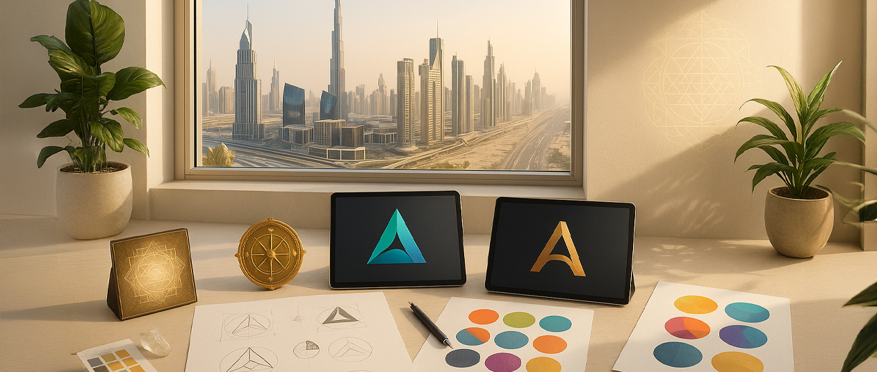
Not just looks, but alignment
Imagine your brand as a person. The name is the voice. The logo is the face. The tone, the body language. When these parts don’t match, people notice—even if they can’t explain why.
We’ve helped brands across Dubai refine this connection. Often, the issue isn’t what’s visible—it’s what’s not aligned. A strong logo paired with a mismatched name vibration. A soft, flowing identity forced into an aggressive shape.
Here’s what we ask when reviewing a company logo design as per Vastu:
Even something as simple as shifting a symbol left to right, or balancing a font’s weight, can tip the energy in your favor.
The case for a consistent frequency
We often say: your brand speaks before you do. But what’s it saying?
In Vastu, numbers matter—not in a mystical way, but as patterns. Your brand name holds a vibration. And when that number clashes with the direction or element of your work, friction shows up—delayed growth, confused messaging, inconsistent traction.
Let’s say you run a tech startup. It thrives on fire and air energy—speed, sharpness, innovation. But your brand name reduces to a water-based number. The result? Great ideas, slow execution. Lots of movement, not much landing.
This is where Vastu for company logo and name alignment makes all the difference. We’ve seen it work. A minor name tweak, or balancing a fire-heavy logo with an earth-based color, can shift the entire flow.
The idea is simple: match your brand’s essence with its energetic structure.
Simple mistakes that hold energy back
Even the best brands sometimes trip up here. Not because of poor design—but because of unintentional misalignment. Here are a few patterns we see often:
At Vedic Vastu Dubai, our process is gentle. We don’t ask you to throw out your brand. We fine-tune it. Adjust here, soften there, realign where needed. And more often than not, clients tell us: “This finally feels like us.”
Branding doesn’t have to shout. It just needs to land. When your visuals, voice, and vibe move together, the connection deepens. And the business grows—not through force, but through flow.
If you’re launching a new identity or feel your current brand isn’t working the way it should, we invite you to take a deeper look.
At Vedic Vastu Dubai, we blend timeless Vastu wisdom with the fast pace of modern branding. We look at your logo, your name, your messaging—and help it all come together in a way that feels honest, stable, and strong.
Because in the end, your brand should reflect who you are. Fully. Clearly. Powerfully.

